The Portfolio of Sarah Bergs
In the course I took, Lighting & Composition I, one of our first projects was to take models already given, and light them however we wished. We had to do two shots: The first was using a pre-set camera established by the professor, and the second shot could be whatever angle we wished.
At the same time, we were given two very different models -- one RD-D2 from Star Wars, a hard surface model with lots of small details, nooks and crannies, and the other was a monster nicknamed "Tiny", who had very organic shapes and softer texturing with the detail being his muscle and scale-like features across his body. His pose was also a wider stance, meaning it would be very important to get a proper outline of his form.
---
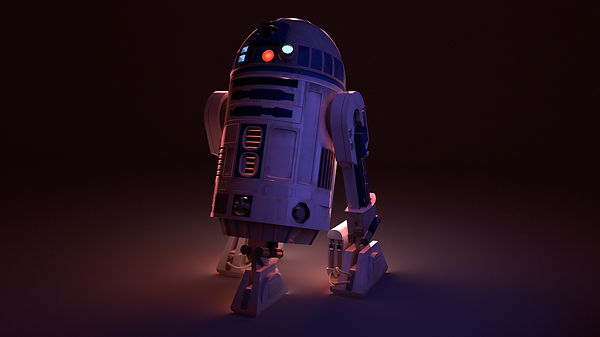
Of all the lighting I did in the class, the first R2-D2 shot is still my favorite, the way its "feet" manage to be the dividing line of where light and shadow meet, it's like he's softly being lit from below. Focusing on the bright yet soft pinks that give him his outline, the gentle purples and blues from the front make sure he's not entirely lost in the shadows, while the bright and recognizable lights on the head of the droid are allowed to bring your eye up there and stand out, not lost to brightness.
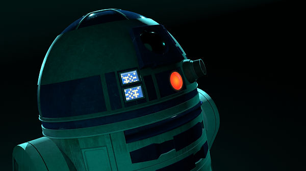
The second shot with R2-D2, I wanted to go for an almost underwater feeling with the teal and cyan blues, once again going for a back-lit style, trying to make sure his outline was present and not lost, with a faint light from the front to make sure his details are still visible.
---
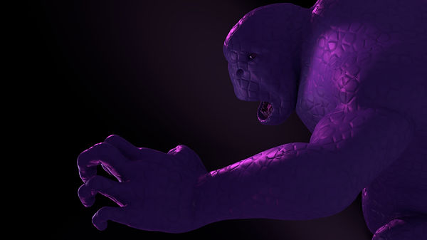
With Tiny, the professor commented that one of the hardest tasks with his pose was making sure the back leg was lit and wouldn't disappear into the shadows. When I looked at the pre-set shot, my idea of the lighting was almost movie-esque -- the light coming from above like perhaps a helicopter was looking down at the monster as it was about to strike someone. The lighting from above helped give form to his back and shoulder muscles, while also reaching the back leg. Relying on the idea that the light would be fairly wide, it helped sell the lighting and reflections elsewhere on his body with the orange/yellow glow. However from camera left, there is also a faint glow of pale green to counter the warmth of the orange and help define his face and chest, while also giving almost a dividing line of shadow across his face and following down his chest to his legs. Is he misunderstood? Caught in a moment of pain and destruction? I guess we'll never know.
The second shot with Tiny, I wanted to focus on framing most of all and the flow of the eye. My lighting perhaps was weaker in this image, as the purple is a little stronger than it should have been, but I did manage to create a line of light that leads in from the hand and towards Tiny's face.

Our next project was an introduction to Color Keys and the Nuke Program. Once again we had to make two shots -- one we weren't allowed to adjust anything, only decide the time of day for the scene. The second, we could rearrange the scene however we like. Either way, we had to make Color Keys for both shots to get approval for our intents.
The first shot I wanted to go for a dusk-like lighting, with soft sunlight thanks to clouds in the distance. It was interesting trying to get the light to show up across so many different materials while trying to make sure that nothing was blown out or was obviously fake. This project also taught using Hero Lights, or lights meant just for the characters so that making sure they were lit properly did not distract or leave strange shadows on the rest of the scene.


For the second shot where we could do anything we wished, I decided to think outside the box quite a bit. Having watched Marvel's Doctor Strange as well as Inception, I recalled their scenes where spaces seemed to fold in on themselves, bringing people into unique positions where normally it would be impossible.
I also decided to treat it as something out of a sci-fi type film or at least along the lines of Bladerunner with the bright neons to really sell the contrast between the two.
It was difficult to get the colors across the scene to properly spread as I wanted and not become a painful glaring color or make the characters entirely lost in the scene. I wanted to make sure each one had a little of the other's main color on them -- the man's color being green and the woman's being red, the colors of their lamps, also complementary by being opposite each other on the color wheel. Creating symbolism through lighting.
The second shot I relied on Nuke far more to try and get the colors to pop where I needed them to, or to correct what I could not easily manage to do within Maya when it came to getting certain colors.


For our final project, we were given a very short animated film to do all of the lighting for in a team project. There were five shots total, to be broken up among the group however we chose. I got the last two shots, as part of the 5th shot was that we got to finish the animation however we wanted. Since I was the only one in the group with any animation experience, I took on the challenge of animating plus lighting the last two shots.
Unfortunately I do not have the finished animation with my team's lighting, but I still do have the two color keys I created for the shots.
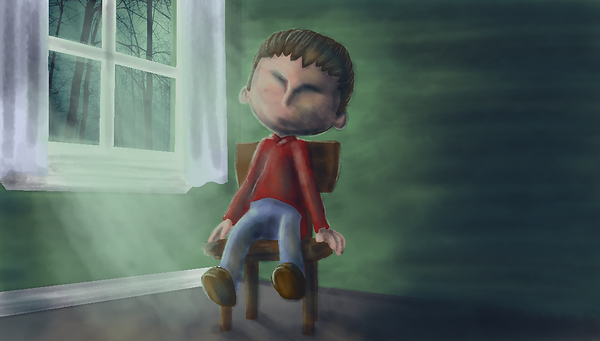
I did my color keys within Clip Studio Paint EX as the more traditional brushes made it easier to get the idea across, focusing on the color instead of anything else, and allowing quick easy strokes.